Making the most out of picture-in-picture
Being limited to a single 15" screen, I'm forced to make the most out of my screen real estate and optimize my window placement game.
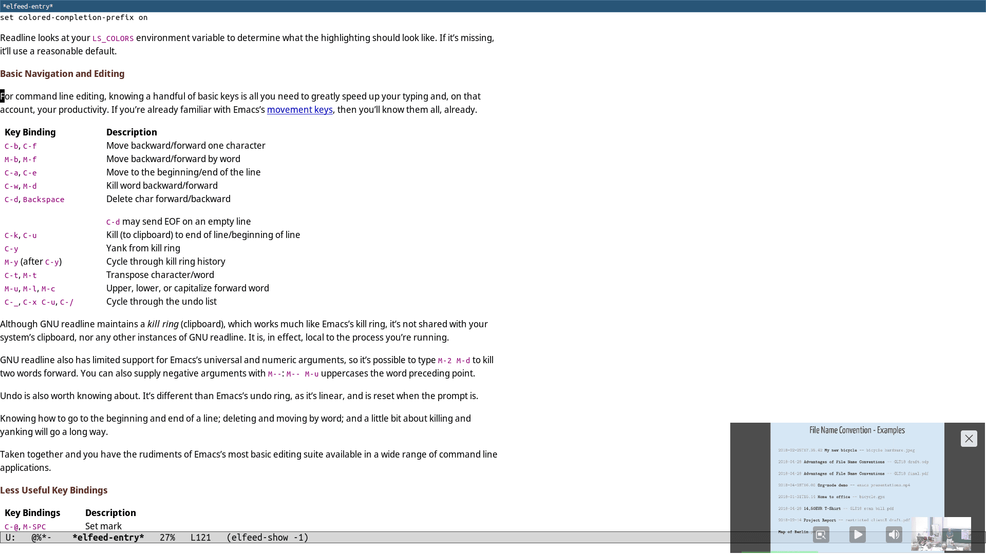
Picture-in-picture is a feature whose potential I'd previously never realized until now. I just did a little experiment and I'm quite satisfied with the results. The idea is to have picture-in-picture windows get automatically placed in a non-obstructive location, be semi-transparent and appear in every workspace.
To match a picture-in-picture window, we can use the following criterion:
[title="^Picture-in-Picture$"]My screen resolution is 1920x1080, so a window size of 500x280 is pretty sensible.
floating enable
resize set width  500
resize set height 280
I don't want to see any borders around the window, so I'll disable those.
border noneI want the window to appear on every workspace.
sticky toggleThe least annoying spot where I could place the window is probably the bottom right corner of the screen.
#               1920    1080
#             -  500  -  280
#             ——————  ——————
move position   1420     800
I don't want the window to obstruct any text that might come up behind it, so I'll make it slightly transparent.
opacity 0.7Let's assemble the pieces that compose our new window rule and take a look at the result.
for_window [title="^Picture-in-Picture$"] {
  floating enable
  resize set width  500
  resize set height 280
  border none
  sticky toggle
  move position 1420 800
  opacity 0.7
}